Tulsa Logo Design
Logo design is an important part of your company’s identity. Your logo design sets your brand apart from others and sets the tone of your company. Jacob Cass, the founder of JUST Creative, rounded up what he thinks will be the top trending logo designs for 2017:
1. Literal Minimalism
In an industry where logos are becoming bold, piled and more complex in an attempt to distinguish itself, it is often the simplest of designs which catch the eye, most notably the “flat design” trend dominating the market.
For this “literal minimalism” evolution, it is important to ensure that the minimalist design is both practical and purpose-driven; the purpose of a logo is to tell your customers what you do immediately and with absolute clarity. eg. the meaning is within the logo itself.
These logos are well received by potential clients because they are more easily understood, although this does not necessarily mean they are better.
2. Hand-Drawn

Hand-drawn graphics were popular in 2016 and this trend is set to gain even more ground in 2017, as it conveys authenticity.
Particularly popular in the food and drink industry, where business owners are determined to project a business that is both self-governing and exclusive from the competition but also off-the-wall and chic.
Hand-drawn logos emanate warmth, credibility, and charisma; three attributes which are more difficult to capture using computer aided design.
Looking to 2017, an increased use of color and tone are likely developments of this trend.
3. Negative Space

Negative space logos will be 2017’s break-out trend, peaking from the rise of 2016.
This style of logo is based around dual-imagery, where positive and negative space each compete for the viewer’s attention. Think the NBC logo, where the negative space is used to create the iconic peacock image.
4. Line Art

First picking up the pace in 2015, the line art logo trend has sustained its position in the industry and is likely to still be on top in 2017.
This trend uses a steady thickness of lines with only one solid color integrated. It can be seen being used by brands who wish to set themselves as fun, modern and laid back. Moving forward, there will be outstanding opportunities for designers to find creative ways to utilize negative spacing into their line art designs.
5. Vintage

Customers have strong emotions and memories connected with the past, and a vintage logo will often speak to them in a way that a modern one will not, playing on nostalgia.
A vintage logo can often convey a sense of credibility as well as a sense of connectivity with the user or brand.
This is something many designers and customers are settling on today, and this will grow in 2017. A word of warning, a vintage logo can often recklessly portray a brand as being out-dated or “stuck in the past”. This is something you must consider very attentively when creating a company logo design as this approach is extremely destructive.
6. Form simplification

There are sloppy people, and there are neat people. We love both, but if logo and branding trends are any indications, it’s time to make room for cleanliness.
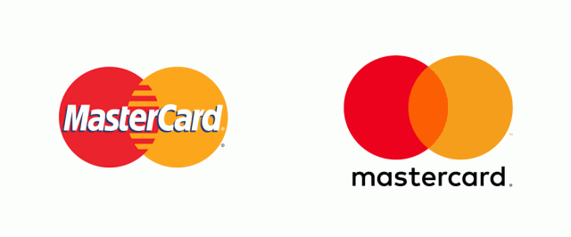
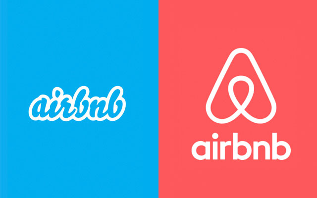
In the recent Mastercard and Airbnb rebrands, visually busy logos were exchanged for streamlined, simple designs.


7. Moving parts
We’ve saved the best for last! One of the most exciting trends on our radar is branding that introduces both logo design variation in printed materials and web-based animated GIFs, such as those below for Ta La Wa, Open View, and Giant Owl Productions.


